Tables and charts
 Relevant for: Workspace owners, administrators (see "User roles")
To create report templates, you use so-called "placeholders". These placeholders are replaced with candidate-specific content and ratings in the final report at the push of a button.
You can use the placeholders in your report template in various ways. This means that you can integrate the placeholders not only into continuous text but also present information from the assessment using placeholders in the form of tables and figures. This allows you to provide a clear presentation of complex information.
Application example: Table
You can also use placeholders to integrate the content of the assessment into your report in the form of a table.
To do this, navigate in Word or PowerPoint to the top menu bar, click on "Insert", and then select "Table". A dropdown menu with many small fields will appear. Hover your mouse over the fields to select the number of rows and columns for your table. Click once on the selected fields, and the table will appear in your Word or PowerPoint template. You can then format it as desired. Place the placeholders in the template in the table exactly where the respective information should appear in the final report.

You can integrate any loops and placeholders into a table. Follow the same steps described above and then select the placeholders that contain the desired information.
 Ensure that you also close the loop(s) in tables by adding "{/loop name}" or "{/}".
Below is an example of how you can set up competencies, target profiles, and competency ratings in a table in your report template. Underneath, you can see the result you will obtain when you automatically generate the report with Applysia.
Template
Result in finished report
You can also format the tables so that individual cells are merged. This can be useful, for example, if you want to list competency clusters in one column and all associated competencies and competency ratings in the adjacent column. To merge the cells of a column, use the placeholder "{:merge-cells-col 1}".
Below is an example of how you can integrate the table with merged cells into your template. Underneath, you can see the result you will obtain when you automatically generate the report with Applysia.
Template
Result in finished report
Application example: Diagram
To add diagrams to your report, you can insert a desired chart into the template in Word or PowerPoint.
Navigate to the top menu bar in Word or PowerPoint, click on "Insert", and then select "Chart". A pop-up window with various chart types will appear. Choose the desired chart type from the menu on the left, then select the specific chart you want. Double-click on the chart or click "OK" to integrate it into your Word or PowerPoint template.
Navigate to the top menu bar in Word or PowerPoint, click on "Insert", and then select "Chart". A pop-up window with various chart types will appear. Choose the desired chart type from the menu on the left, then select the specific chart you want. Double-click on the chart or click "OK" to integrate it into your Word or PowerPoint template.
By default, the chart will include a predefined number of categories (later competencies) and data series (e.g., overall rating and target profile). Ensure that the chart in the template contains the same or fewer categories and data series than will later be included in the report. Alternatively, you can manually delete additional categories/data series after generating the report.
Here is an overview of the chart types available from Microsoft. Only Microsoft-provided charts can be integrated into your template, as placeholders and the "filling" with assessment-specific information will not work with other chart types.You can also use placeholders for charts. These placeholders will automatically be populated with the values from the assessment during report generation. Not only will the candidate ratings in individual competencies or exercises be added, but also the axis labels and legend will be integrated into the chart at the push of a button. All the information you see in the template will then be replaced with assessment- and candidate-specific values and content. You can define the axis labels according to your individual requirements. More information on this can be found here. You can also manually adjust the chart title - either in your template or in the final report.
To do this, insert the placeholder into the chart title. Alternatively, in Word, you can place the placeholder below the chart. Additional information about placeholders for the automatic creation of charts can be found here.
If you have enabled the "Use scale labels instead of numbers" option in your templates in the administration interface and are using symbols as scale labels, these cannot be transferred to the charts. Please note that the scales of the charts will still be labeled with numbers.

In the appendix (at the bottom of this page), you will find a Word document combining different chart types and placeholders. You can download the file, copy the desired chart template, and integrate it into your report.
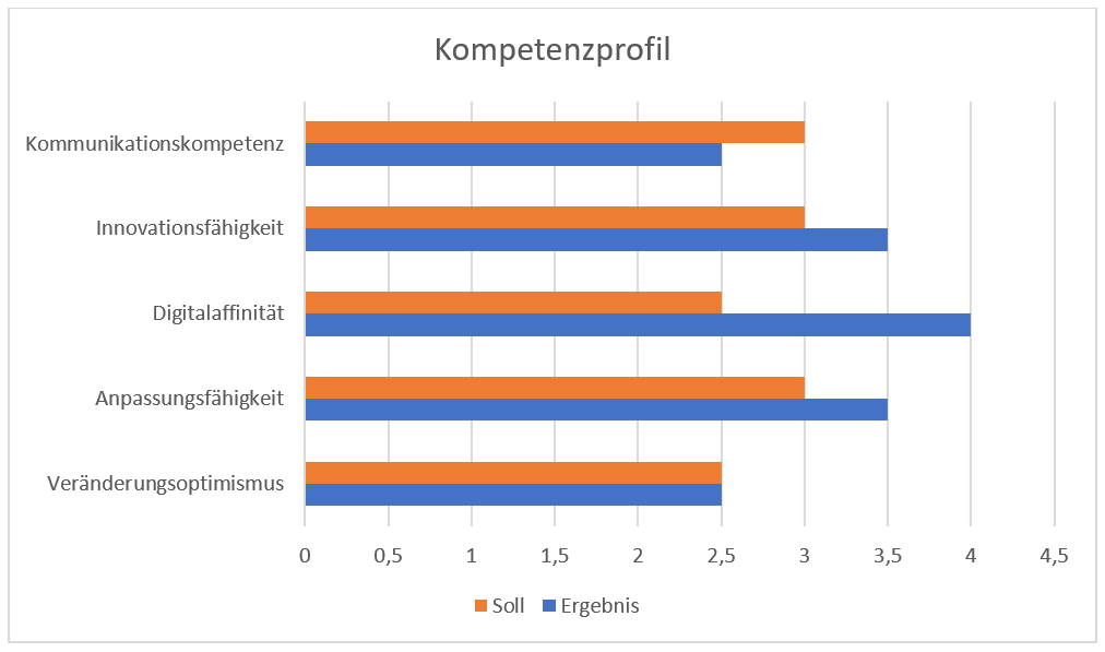
Below is an example of how to use placeholders for creating charts. Underneath, you can see the fully "populated" chart with the assessment information as it will appear in the final report.
Template
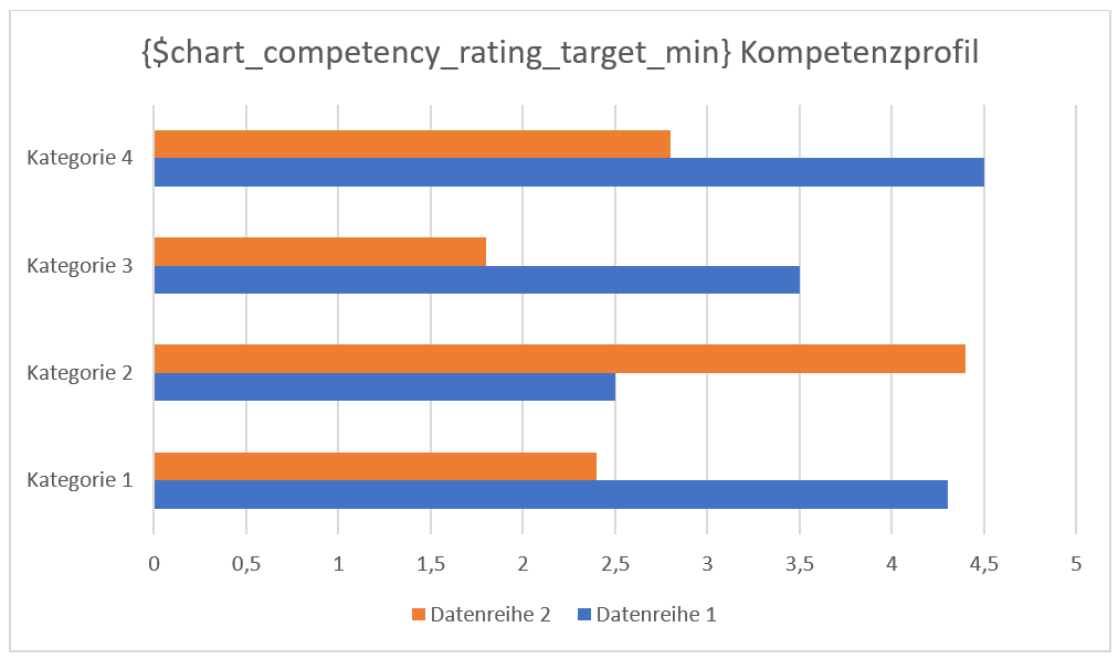
Result in finished report
Related Articles
How can I export graphics and tables?
You have the option to export the images of the consolidation as well as the conference. To do so, navigate to the respective areas (consolidation or conference). In the upper right corner of the images you will find the "Save" icon. By clicking on ...Conference: Overview
Relevant for: Normal observers, Lead observers, Moderators (see "User Roles") In the assessment overview, click on "Open Conference" at the bottom of the schedule, and a new page will open. If the assessment is still in draft status, you cannot start ...User roles in the administration interface
In the browser-based administration interface, you can manage your assessments & templates, the users of the software and your workspace. Not every Applysia user has access to the administration interface, this depends on the user role they have been ...Conference: Overview
Relevant for: Normal observers, lead observers, moderators (see "User roles") In the assessment overview, click on “Start Conference” under “Conference” at the bottom of the schedule, and a new page will open. If the assessment is still in draft ...Create report templates
Relevant for: Workspace owners, administrators (see "User roles") The reporting tool from Applysia enables you to create automated, candidate-specific result reports based on your completed assessments. To do this, you can set up a customised report ...